Tuesday 6 May 2014

Evaluation

This is my evaluation of my final work i will be talking about the processes i have done to this and what i have changed. 

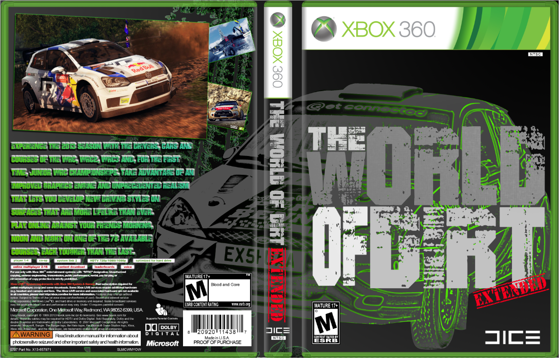
The Technics i have used are pen tool, layer mask, gradient, colour, size tool, magic wand and others i think. so firstly i got my main image and used the pen tool to cut it out of the image so i ended up with just the image, i than made the image into a gray, black and white image. than i took the image changed the contrast around than after all this i made it into a line drawing with technical with the fill in gradient setting to finally get the image it the way it needed to be before i duplicate it. after this i changed the image to have a green outline and tint this image was than layered mask to create a layer that was peeled away by using the gradient tool. the Main title "WORLD OF DIRT" was made out of many different text that i changed the colour than ratersize it to an image so than this means i could edit to the right size so i could create a block of text in different sizes this was really effective so i kept it but changed the colours make it stand out more from the background image, this made it have a big impact on the game cover. i used the same method of the main image on the text on the back cover and the background image behind the text and car.

I am very happy with the design i have created it its all the criteria that i have set my self in that it has the effect of  professional game cover. with loads of effects and multiple levels for each image, to give it as smooth and professional look as possible. The design has changed a lot since the beginning of my work in the initial image and text layout. if i was going to change a few things it would be the main image i used to be more a famous car  with a more graphic design and background with it. as this is letting my work down. The title i am very happy with as it worked better than i expected in that a it is covering a lot of my work and is in the center i thought it was going to be to outrages but in the end it worked our brilliantly, with the colours i have chosen. this bring me on to a new point in that my colour palet that i have chosen is very simple in design as i used white to black with the grays in between. i only used a few more colours the main colour that stands out is green, as i thought this will look good tin the end plus it was a mistake that ended up to work to my advantage. the only other colour that has a big impact is the red "EXTENDED" that really brings some life into the work. now i am going onto the text on the back in the multiple colours i did this as one colour of dark green was lost in the background image so i decided to put a mask on it in a more blue colour that helped it stand out from the background, so if i did change this i would keep the same colours but change the type of font to a sans serif with an impact look to it. now going to the background i only have one image which is of a tyre imprint this has had also a mask over t with a plastic shrink glossy look to it. this also has a green outline to make it stand out more clearly from the background. if i was gong to change any thing else it would be the amount of images  in the background as i would put more types of tracks and a lot ore to fill it up to the brim making it a busy background to help the game stand out due to all the lines and crossing of green but this could be overdone and not look good so i will look into it. so for the final time this is my final piece. it will be some where on this post as Blogger likes messing up with things =) 

Monday 5 May 2014

FINAL Piece update

this is my final piece i will be doing more onto this over time but this is the finished article i have changed some features and designs on it from the other one. I have added a track into the back of the back cover, i have also moved the images around on the top to a more organised state. the new design has also had a few changes to the text on all parts. as the "EXTENDED" has got a more red tint and more vivid colour. i have also changed "DIRT" on the main title to a more white colour to make it stand out. I have also created a gradient for the text on the back to create a more pro look for it and make it stand out more from the track.
As you can see the image below is the before and the image on top is the completed final. so you can look at the changes i have made, and now it looks a lot better!!!

Friday 2 May 2014

Test 3 converting an image into a line drawing


 This image below is the final it will still need some work onto it, it is still a work in progress and it is taking an age to do. i used illustrator with the line tool. i have used comic and technical lines to achieve this. i hope to use this technique and than fill it into the correct colours than the image will fade from colour to the line drawing and than to a hand sketch in one image.
Add c

Thursday 1 May 2014

Test 2 testing with shading on the colours of a vector car

Testing with a a line drawn car from the internet than i choose this as i can have a lot of shading on it. i started with this image from that i used live paint to create it into a vector image. from this i used a gradient fill on one layer to give the shading. i than faded this on the top layer. i than got the vector again to colour in with the colour i want. then i put this layer behind the top layer, after this i started adding the colours for different parts of the car. i then started to fine tune it with more colours contrast and gradient fills. the bottom image is the finale and i am very happy

The bottom image is the final for this test and i am very happy with it. ready to trace an image to line for next test


Wednesday 30 April 2014

Test 1 illustrator testing out with a line drawings


This is the first test i have done i got some vector images and started to mess around with colours and how i will get the outline for my final image i am happy with these as it is just the beginning for vector images 

Saturday 26 April 2014

Detailed analysis of game cover


This is a game cover  for a first person shooter. The games is Battelfield 4.

Section 1
on this game cover there are 4 things we look at Contrast, Repetition, Alignment and Proximity. or known as C.R.A.P.

firstly the contrast this is when two or more thing clash to give it a contrast and make it stand out. so the white text on the front saying battlefield to the black background, or the orange contrasting with the black and white. other things that contrast are the two images on the front as one is big and bold the other is more discrete but still both stand out due to each other. on the back of the cover the white text again contrasting with the black dark background but on the back it has a white streak to make it have a contrasting and eye catching look.

Secondly is the repetition on this game cover the only thing I see repeated is the same character repeated three times twice on the front and once on the back. but these are all slightly different as they are in different backgrounds and different positions but they are all the same character

Thirdly the Alignment this is when text images and logos line up on this the front cover has only a few alignments the first is the two solders both in the centre also not so clear the main title lines up with the information on the back so the bottom of the text is the top of the legal information. on the back of this cover there is a few more as the critic reviews and the reviews these are on an angle at the same degrees. and are on the same line. the other things are the legal information copyright and game info are all lined up with the barcode. this makes it have a clean and professional look to it. 

Final the proximity this is where items are collected together so on the back all the reviews are put together and all the legal information with copyrights are also put together. this creates a more professional look and keeps every thing tidy and clean.


Section 2
In this cover it's not very busy in text but it has a lot of images. The hierarchy on this game cover is the main character then the text as it stands out more then the title. On this cover it also has a range of other things like iconography as the image of the that solider is a very well known image of all battlefield game, as of the solder coming out of the mist with a military rifle and with the look of anger and readiness to fight. Also the text is also iconography as it is the same text in battlefield 3 or very similar. The typography on this is a sans serif and it has a clean and cool design to go with it well known with battlefield. the title is also known as a display font as its bold simple but has a big punch. the game cover also includes the company that made it in this case Dice but with the publishers EA and also including other company's like blue ray and adobe sound this shows it is a high end game.

Battlefield 4 box cover

Tuesday 1 October 2013